When it comes to lead capture forms, a lot of people wonder, “What should I ask of my prospects?”
While everyone has their recipe of fields they think are most valuable to their marketing departments, 96% of businesses say that there’s one field that’s absolutely critical. One field that you should, above all others, capture on every single one of your forms.
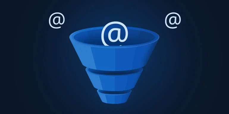
Email address.
The reason is simple: Email is your most powerful marketing tool, still. Consider these stats:
- You’re 6x more likely to get a click-through from an email marketing campaign than you are from a tweet.
- Email is 40x more effective at acquiring new customers than Facebook or Twitter.
- When it comes to purchases made as a result of receiving a marketing message, email has the highest conversion rate, at 66%, when compared to social, direct mail, and other marketing methods.
- 71% of people prefer to receive promotional content through email, compared to 17% who prefer social media.
- Email marketing drives more conversions than any other marketing channel, including search and social.
- Email marketing has an ROI of 3,800%.
And while landing pages are great at capturing email addresses, there’s one kind of page that does the job even better.
What is a squeeze page?
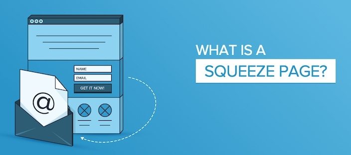
Let’s say you’re surfing Facebook, and you click on a link to one of your favorite blogs. You begin reading, and just about halfway through the article, you’re interrupted with a pop-up that asks for your email address.
That’s a squeeze page.
Well, to be fair, that’s only one kind of squeeze page.
Squeeze pages are designed specifically to capture a prospect’s email (and sometimes other things) to grow a business’ subscriber base. The best squeeze page examples not only convince visitors to hand over their email but justify a reason for doing so. You’ll see what we mean later on in the post.
The difference between a squeeze page and a landing page
landing pages and squeeze pages share the same relationship that rectangles and squares do:
All squares are rectangles, but not all rectangles are squares.
Similarly, all squeeze pages are landing pages, but not all landing pages are squeeze pages. And that’s because landing pages are designed with one particular goal in mind. That goal isn’t always to capture a user’s email address (like the goal of all squeeze pages).
Below are some squeeze pages that we dissected to give you a better idea of how to best grow your email list using them as examples:
1. GQ
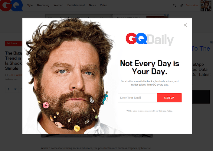
What they did right:
- The recognizable photo of Zach Galifianakis serves as an authority badge of sorts, associating GQ with powerful celebrities.
- The ultra-short form only asks prospects for one piece of personal information: email.
- The CTA button color contrasts the white page well.
What to improve:
- The headline and the picture complement each other, but they don’t convey much of a benefit.
- The sub-headline, while conveying a benefit, does so in a vague manner. Life hacks? Brotherly advice? Insider guides? GQ has the benefit of being one of the most recognized men’s brands around, so why not tout it? Tell you readers to join the swarm of people who have likely already subscribed to GQ daily, or let them know they’ll get lifestyle advice from some of the world’s foremost experts, or style tips from celebrities. There could be a much better value proposition here.
- The CTA button copy is a bore. If the goal of GQ Daily is to help men be better, why not use something like “Make me better” as your button copy?
2. MarketingSherpa

What they did right:
- The headline leverages social proof by inviting the visitor to join thousands of weekly readers who take advantage of MarketingSherpa’s free advice.
- The copy is benefit-focused, letting readers know exactly what they stand to gain by forking over their name and email address.
What to improve:
- Why include a link that reads “No thanks, take me to MarketingSherpa” when there’s a “Close” button in the upper right-hand corner of the pop-up. You don’t want to make it any easier than it already is for users to click out of your squeeze page.
- The copy is redundant. When you combine the words in the red bar with those in the headline, you get everything that’s said in the content below it. Your headline and your sub-headline should complement each other, not say the same thing in differently sized fonts.
- The “About us” link has no place here. If the reader wants to learn more about your business, they’ll do so from your website’s main navigation bar. Helping them navigate there from this squeeze page does nothing but give them a way to escape.
- The CTA button copy should be written in the point of view of the reader, not of the writer.
3. Smart Insights

What they did right:
- The word “free” is the first thing you see on this squeeze page.
- Company badges associate Smart Insights with well-known brands like Unicef, Vodafone, HP, and Canon.
- Testimonials from real marketers boost trust. Though, it would be better if they had some pictures next to them.
- The short form only asks for email address, not even name or company.
- The bulleted copy quickly covers what you’ll receive by downloading the templates.
What to improve:
- The CTA is bad, bad, bad. “Get access”? Come on, now. There are many better phrases to use on your CTA.
- The offer is too vague. I realize I’ll get free templates, but what are they going to do for me? I’ll learn best practices for what? A strategy for what? I’ll get alerts on the latest developments regarding what? More specificity would help here.
4. Forbes

What they did right:
- The copy is filled with persuasive words like “Exclusive,” “Secrets,” “Premium,” “Richer,” and “Free.”
- The button copy is written in first person.
- The content is short but informative. Users know exactly what they’re going to get when they enter their email address to download a copy.
- The button color isn’t bold or bright like the other squeeze pages we’ve already discussed. However, it contrasts the rest of the page. Contrast is always more important than color.
What to improve:
- Social share buttons should be on your “Thank You” page, or in the report itself, not on your squeeze page. People want to know your information is worth sharing before they do so with their networks.
- The 2014 copyright information is outdated. If this is, what else could be? Is the information in the report old news too?
5. NetApp
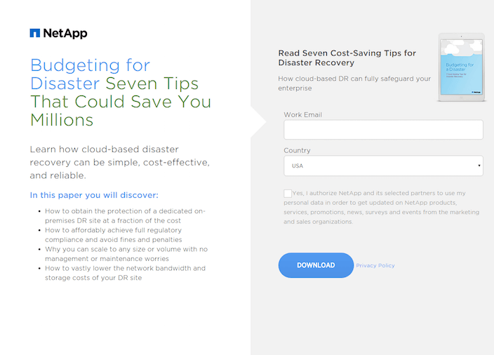
What they did right:
- The headline is benefit-oriented, explaining to the prospect that they can save millions by reading “Seven Tips For Disaster Recovery.”
- The copy is concise, but informational. We know exactly what we’re going to get by downloading.
- The form only asks for email and country. The less fields you include, and the less personal they are, the more likely it is that your prospect will fill them out.
- The opt-in box isn’t already checked unlike many squeeze pages. By letting users opt in instead of unchecking the box to opt out, you’re passively increasing the quality of email subscribers you generate using this form.
What to improve:
- The CTA button is incredibly boring. It contrasts the rest of the page, which is good because I can find it easily, but it doesn’t compel me to click at all.
6. Backlinko
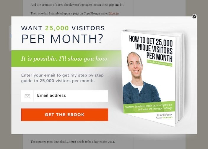
What they did right:
- A powerful headline promises to teach the reader how to generate 25,000 unique visitors per month to their website.
- A short form that doesn’t even require the reader input their name. While name is a valuable field to include on your form, the most important is email. The less fields there are on your form, the more likely they are to convert (most of the time)
- A custom, professional-looking ebook cover really shows that this author went to the trouble to make the content graphically appealing. Believe it or not, this can have a big impact on downloads.
- The brightly-colored button draws the user’s attention. There’s no confusion about where to click on this squeeze page.
What to improve:
- The call-to-action on this squeeze page is kind of weak. Instead of cookie-cutter copy like “Get the Book,” try something unique like “Show me how!”
- The language is a touch vague. Sure, we understand what Brian means by “Get 25k unique visitors per month,” but to where? To our blog? To our website in general? What? Clearing this up might help me decide whether I need this ebook.
7. Fisher Investments

What they did right:
- The call-to-action is in the first person. “Get My Free Guide” is always better than “Get Your Free Guide.”
- The title of the ebook emphasizes “quick.” In it you’ll learn how to develop a retirement plan in just fifteen minutes.
- The button color is bright and bold, and the shadow underneath it makes it actually look like 3D button. This may sound strange, but making a button look like a button is something a lot of designers struggle with.
- The arrow pointing to the form serves as a visual cue to guide the prospect to the form.
- The copy tells users what to expect after downloading the ebook. It’s a 9-page, 15-minute read, in which you’ll learn: the truth about how long your nest egg will last, why it’s vital to prepare for a long retirement, and how inflation can impact your retirement plan.
- Social proof is included on the form – “Over 1.3 million downloads and counting.”
What to improve:
- Capitalization of words on this page is funky. Why is every word capitalized? This is a technique you can use in titles, but that’s where it should end. Capitalizing every word of your copy just hurts readability.
8. Business Insider

What they did right:
- The content includes persuasive words and phrases like “Exclusive,” “Be in the know,” “Get ahead of the curve,” and “Free.”
- The body copy tells you exactly what the benefits are of downloading this report.
- No credit card required lets visitors know that only email address is required to download the report.
What to improve:
- The headline isn’t as benefit-oriented as it should be. Sure, “Be in the know” is persuasive, but telling me how I’ll benefit from being in the know is more persuasive.
- Copyright information is out of date. This is easy to change, so why ignore it?
9. Digital Marketer
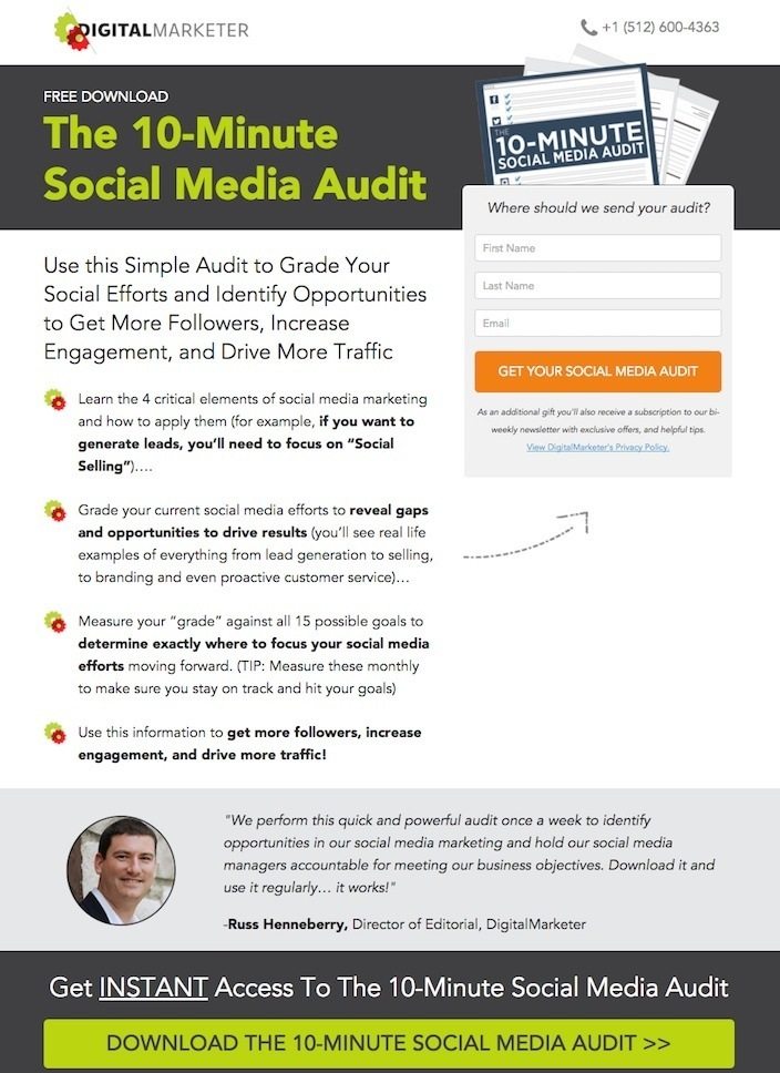
What they did right:
- The headline highlights a quick and easy solution for marketers who want to better measure their social media: The “10-Minute” Social Media Audit.
- The sub-headline is benefit-oriented, explaining what the prospect stands to gain by downloading the ebook.
- The CTA buttons on this page both contrast the colors they’re set on.
- The arrow serves as a visual cue to guide the reader toward filling out the form.
- The message on top of the form justifies the need for the prospect’s email address, saying “Where should we send your audit?”
- The message on the bottom of the form explains that the prospect will receive an additional “gift” by subscribing them to Digital Marketer’s newsletter with exclusive offers and helpful tips. Most forms include an email list opt-in at the bottom, but not many make subscribing sound like a free gift.
- The contact information in the header gives people a number to reach if they have any questions or concerns.
What to improve:
- The sole testimonial on this page is from a Digital Marketer employee. Sure, we get that this is the audit used by the company itself – but isn’t that already assumed? A testimonial from someone who’s not part of the organization would be more valuable than someone who is.
- The phone number in the upper right-hand corner isn’t click-to-call.
10. Boco Living

What they did right:
- The offer is enticing. You mean all I need to do is give you my email address and I get 10% discount on coffee products? Heck yes.
- The short form only requests an email address, no name required. This relieves friction for people who are hesitant to share too much personal information about themselves over the web.
- The privacy message that reads “Your information will never be shared” is a great way to quell any fears users have of ending up on some spammer’s bulk email list.
What to improve:
- The call-to-action could be improved. “Sign up” is second only to “Submit” when it comes to the most boring CTA copy.
- The generic look could be improved altogether. You’ll notice that a lot of the others on this list include images, branding, logos, etc. At least one eye-catching graphic would add value here.
11. Mindflash
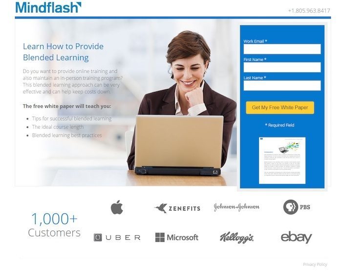
What they did right:
- The headline is benefit-oriented. Prospects realize that by downloading this white paper they’ll learn how to provide a great blended learning program.
- Copy is bullet-pointed to enhance readability.
- Company badges highlight some of the big-name customers that Mindflash caters to.
- The phone number in the upper right-hand corner gives prospects a way to contact customer service should they have any questions or concerns.
- The button copy is written in first person.
What to improve:
- The phone number isn’t click-to-call. That means if someone is visiting this page on mobile, they’ll have to manually punch in this number to reach someone.
- That white paper preview below the form is useless, unless you have Eagle eyes. Can you read any of that?
12. Investor Carrot
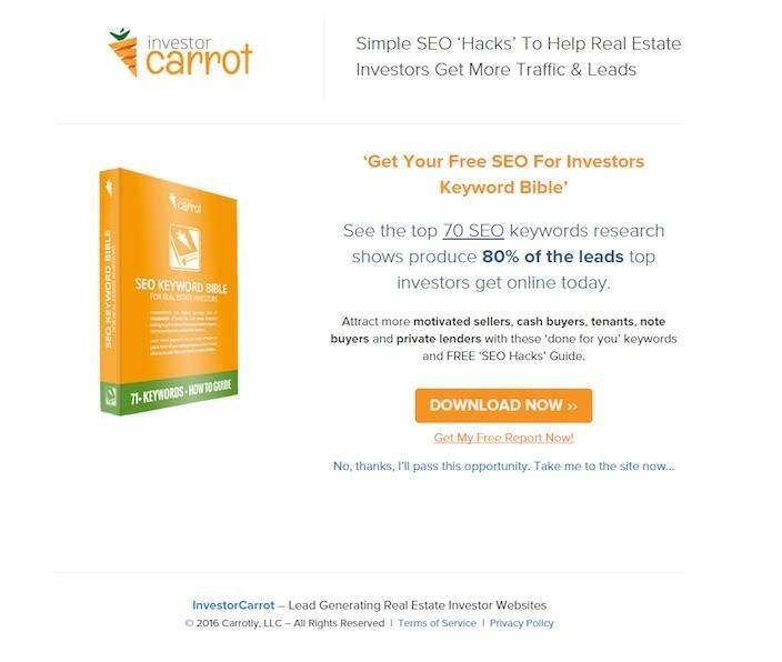
What they did right:
- The headline is benefit-oriented. Real estate investors stand to gain more traffic and leads by downloading this report on “simple SEO hacks.”
- The copy emphasizes “Free” and provides visual cues like bolded letters to draw attention to key points.
- The picture of the “keyword bible” shows visitors exactly what they’ll download before they click-through and convert on the form.
What to improve:
- The number of outbound links on this page is too high. The more there are, the higher chance there is that your prospect finds their way off the page.
- Having two CTA’s one after the other like that is unnecessary. The copy below the button is more compelling than the copy on the button itself, so why not use that instead?
13. Elegant Themes
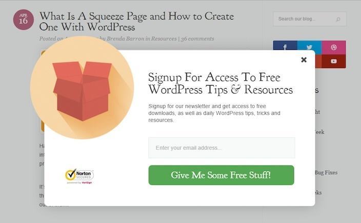
What they did right:
- The form is super short, only requiring email to get access to free, valuable content.
- The CTA button is bright and contrasts the rest of the pop-up well.
- The security badge in the lower left-hand corner assures prospects that their information will be kept secure.
- The button copy is written in first person. “Give me some free stuff” as opposed to “Get your free stuff.”
- “Free” is highlighted several times on this squeeze page.
What to improve:
- Word choice on the CTA button could be improved. Why use “Give me some free stuff” when you can emphasize what the user stands to gain by completing the action? How about something like “Send powerful secrets to improve my WordPress site!”
- The word “Signup” is used incorrectly here. What they’re trying to say here is “Sign up for access…” not use “Signup” as a noun. This might not be a major pain point for all, but if I noticed it, there are certainly others who wouldn’t want to take advice from people who can’t tell the difference between a noun and a verbal phrase.
14. Simply Recipes

What they did right:
- Eye-catching photos of delicious food compel me to sign up so I can learn how to cook meals like the ones pictured.
- The copy clearly conveys the benefit of signing up for email alerts.FOMO (fear of missing out) is leveraged in the statement “Never miss a recipe.” When we fear we’re going to miss out on something (like a new, delicious recipe in this case), we’re more likely to opt in.
- The word “free” is capitalized to draw attention to the fact that all the user needs to do is provide their email address to get valuable information at no cost.
- The call-to-action is written from the reader’s point of view. Writing “Sign me up” instead of “Sign up” increases the likelihood your visitor takes action.
- The logo aligns the form with the brand, an example of great message match.
- The short form asks for email only, nothing else.
What to improve:
- The color of the CTA button could be a little brighter. Dark brown doesn’t exactly proclaim “Here I am! Press me!”
15. Fathom
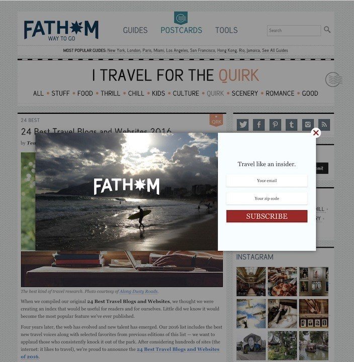
What they did right:
- The CTA button color is bold, bright, and attention-grabbing.
- The photo of the beach incites wanderlust, making visitors want to click the CTA button to learn new ways and places to travel.
- The logo aligns the pop-up with the brand, letting viewers know that this isn’t another company’s ad; it’s a squeeze page designed to give you more information about travel.
What to improve:
- The headline, “Travel like an insider,” doesn’t mean anything to me. What do I stand to gain by signing up? Will I get travel tips? Discounted airline tickets? Making the headline more benefit-focused is sure to boost conversions on this squeeze page.
- The copy on the CTA button is in all caps. This comes across like you’re being yelled at through text. Reserve all-caps for the word “FREE,” (and even in that case, don’t overuse it) and use them sparingly otherwise.
16. Nomadic Matt
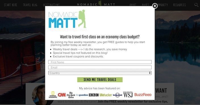
What he did right:
- The headline is extra engaging – displaying a benefit while also asking a question to which the answer is an obvious “yes.” Do you want to travel first class on an economy class budget? Of course you do.
- The CTA button is written in first person, it contrasts the rest of the page, and it’s results oriented. By clicking it, I will get some awesome travel deals.
- Company badges showcase all the big-name publishers who have featured Matt’s advice.
- Bullet-pointed copy briefly conveys all the benefits of signing up for Matt’s email newsletter.
- The word “free” is capitalized in the copy to draw attention to it.
What to improve:
- The white space in the upper right-hand corner of the page makes it look unbalanced. Granted, we’re being nitpicky because this is an all-around great squeeze page, but don’t you think there’s something missing up there? Maybe centering his logo would solve the problem.
17. AKIRA

What they did right:
- This form is basic and gets to the point as quickly as possible.
- The pop-up quickly explains the benefit of entering your email. You’ll get 10% off instantly.
- The “Google Trusted Store” badge not only boosts trust, but also aligns the brand with one of the biggest and most authoritative companies on the planet.
What to improve:
- The headline “Stay on Top” doesn’t mean anything to me. The smaller, less-emphasized words below do, though. Using “Get 10% Off Instantly” as the headline would convey the benefit of signing up much clearer.
- The CTA button doesn’t look like a button. Remember how we told you earlier that some designers have trouble making buttons look like buttons? This doesn’t even look like a button at all. Even if it did, it would get an “F” for copy. “Submit” is maybe the worst word you can use as a call-to-action.
18. Matco Tools

What they did right:
- A benefit-oriented headline conveys that those who download the report will learn how to make money from home with Matco Tools.
- A bold, bright CTA button that includes the word “free” compels users to click
- The testimonial is from someone who has found success and stability as a Matco distributor – a kind of rags-to-riches story. They’ve included his full name, as well as a picture to boost credibility.
- The section titled “The Matco Difference” briefly (but powerfully) displays the company’s unique selling proposition.
- Trust badges on the bottom of the page help build credibility and ease any anxiety the prospect has about doing business with Matco.
What to improve:
- Spelling mistakes like “Fincancing” are inexcusable. You won’t be taken seriously as a business if you get caught spelling words wrong in any of your marketing materials.
- The copyright information on the bottom of the page reads “2015.”
19. Problogger

What they did right:
- This headline is doubly engaging, asking a question and conveying a benefit all at the same time, just like Nomadic Matt did. Do you want to improve your blog? Of course you do.
- The form only asks for email, nothing else.
- The CTA button is bright, and contrasts the bland page, while the “No thanks” button blends in with its surroundings, diverting attention away from it.
- The subheadline explains the benefit of inputting your email and clicking the CTA. You’ll get free weekly updates with the latest blogging tutorials.
What to improve:
- The plainness of this squeeze page is great because it doesn’t distract the user from the task at hand, but it might just be too plain. How about a customer testimonial that speaks about results they’ve enjoyed since taking their advice? Or maybe an authority badge here and there. There are definitely some elements that could be added to make it more persuasive.
20. Cookie + Kate

What they did right:
- The copy let’s the reader know why they should subscribe: They’ll get new posts, and a welcome guide with 5 printable dinner recipes for free.
- The photo is professionally taken, and serves as an example of the delicious foods you’ll be able to cook when you subscribe.
What to improve:
- The headline could be more benefit-focused. While questions are great to use in headlines, this one doesn’t quite compel us to take action. Why would we want more recipes? What do we stand to gain? What about using something like “Delight your taste buds with new, delicious recipes delivered free to your inbox”?
- The CTA button color doesn’t compel me to click at all. Sure, it contrasts the white background, but it’s the same color as the rest of the text on the pop-up. When choosing a button color, try to make it stand out from every other element on your page.
21. CXL

What they did right:
- This simple form only requests email. The fewer fields you include, the easier it is for your prospects to fill out.
- Words and phrases like “step-by-step process,” “boost profits,” “master the essentials,” and “free” make this squeeze page very persuasive.
What to improve:
- This CTA button blends in with the rest of the squeeze page, making it easy to miss. A more contrasting color and a different shape would make it “pop” more.
- This CTA should be tested against copy written in the first person. Instead of “Get Your Free Ebook” try “Get My Free Ebook.” It’s been proven to boost conversions.
- The link that reads “No, thanks. I like having a low conversion rate” is unnecessary. There’s a red “X” up in the corner of the page, so if the prospect doesn’t want to convert, they’ll click that. No need to give them a second way to leave.
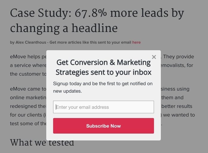
We came across another squeeze page of CXL. This time on a blog article:
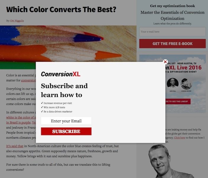
What they did right:
- The copy provides a clear benefit: learn how to increase revenue, A/B test better, and become a data driven marketer.
- The CTA button really pops on this squeeze page.
- The logo let’s the prospect know this is a squeeze page from CXL and not spam.
What to improve:
- The left alignment of this form is awkward. Are we missing something? No, seriously, is there an image missing?
- “Subscribe” is a poor choice for CTA button copy. Why not be more creative and action-oriented like, “Sign Me Up?”
22. CoSchedule

What they did right:
- This super short form only requires the prospect input their email.
- The images, including the one that reads “+10 MORE,” gives prospects an idea of what they’ll get after converting.
- The logo at the top of this squeeze page lets prospects know that it’s CoSchedule’s offer and not some spammy pop-up.
- The CTA button copy is compelling, containing words like “unlock,” “ultimate guide,” and “free.” It’s also written in first person.
What to improve:
- The “No thanks, I don’t like free things” link isn’t needed. It gives visitors an extra way off this landing page.
- The CTA button doesn’t stand out as well as it could here. Its color is already used several times on the page.
23. Incomediary

What they did right:
- The headline stops you in your tracks, and sub-headline conveys a strong benefit.
- The text above the form “Where should I send your video?” justifies the need for the prospect’s email address.
- The text below the CTA ensures the safety of visitors’ personal information.
- The CTA button color stands out on this light blue.
24. Mirasee

What they did right:
- The headline leverages social proof.
- The CTA button color really grabs your attention.
- “FREE” is emphasized in the copy above the form.
What to improve:
- The copy below the CTA button is contradictory. It claims that by submitting your name & email, you won’t be signing up for anything – but then it says you’ll receive emails having to do with this site. Isn’t that signing up for something?
25. Emma
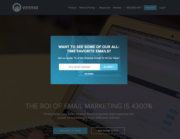
What they did right:
- The form only requests a visitor’s email address making it easier and quicker to complete.
- The opt-out link below the CTA reading “No, thanks” is much less obnoxious than what you’ll find on many squeeze pages. Statements that read “No thanks, I don’t like money” just make prospects roll their eyes.
- The “No Thanks” link is necessary for this squeeze page because there is no other way to exit out without clicking that text link.
What to improve:
- A blue CTA button on a blue background makes it easy to miss.
- The headline and copy on this page are all about “me, me, me.” “Want to see some of OUR all-time favorite emails?” “Get OUR guide. 12 of the smartest emails to hit OUR inbox”? Everything should be rewritten to focus more on the customer.
- The word “Submit” should be changed to something less plain.
26. Search Engine Land

What they did right:
- The CTA button copy is written in first person.
- The CTA button color pops on the white page.
What to improve:
- The headline conveys a clear benefit, but it could definitely be stronger. How do they make search easier for the prospect?
- What does “We take your privacy seriously” mean? If you want to let prospects know you take their privacy seriously, tell them it will stay private.
- What is a “SearchCap?” What will prospects get by signing up for it?
27. Capterra

What they did right:
- The headline has “Free” written right in it.
- There’s only one way out of this pop-up, and that’s by clicking “I don’t want to improve my lead gen strategy.”
- The green CTA button contrasts the white background well.
- The copy emphasizes benefits. By downloading, the prospect gets lead gen tips and best practices.
- The picture of the ebook shows visitors exactly what they’ll be downloading once they enter their email address.
What to improve:
- The headline, while containing the word “Free” could be more compelling and action-oriented. We know the two most powerful words in copywriting are “You” and “Free,” so why not say “Get your free B2B eBook?”
- The CTA copy could be improved to read something like, “Send Me the eBook!”
28. Loopd
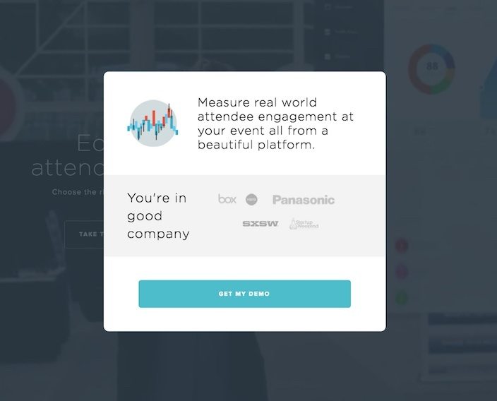
What they did right:
- Company badges of some highly reputable brands boost trust.
- The turquoise CTA button pops against the white background.
- The CTA is written in first person.
What to improve:
- There’s no visible exit off this squeeze page.
- There’s not enough information on this popup to convince me to get a demo. What’s in it for me? Showing me how your product works sounds like it’s more about you.
- The CTA copy text size is too small for the button.
29. Web Profits
What they did right:
- The headline and copy convey the benefits of subscribing. Though, it could be taken one step further. What will sending conversion and marketing strategies to your prospects’ inboxes do for them? Boost profits? Grow their customer base? What about this instead: “Boost Conversion Rates With Expert Marketing Strategies Sent Right To Your Inbox.”
- This CTA button color makes it stand out against the gray background.
What to improve:
- The CTA “Subscribe Now” is too cookie-cutter.
- The word “Signup” is the noun commonly confused with the phrase “Sign up.” Based on context, “Sign up” should be used here instead.
30. The Tyson Report

What they did right:
- The headline capitalizes on our universal desire for money (“close 30% bigger deals”) and quick fixes (“one pricing ‘trick’”)
- The short form only requests an email address from visitors.
What to improve:
- Words like “Welcome” and “Sign up” make this squeeze page too generic. A CTA like “Send me the secret!” would be much stronger.
- These colors clash with each other. A bright green CTA on a bright blue background hurts to look at.
Capture emails and grow your subscriber list with a squeeze page
Squeeze pages help marketers build the most valuable tool for nurturing leads and turning them into new customers:
An email list.
To create great squeeze pages, remember to clearly convey to your prospect the value of converting, and actually deliver on it once they’ve handed over their email address.
Use these 30 critiques and Instapage’s fully customizabl landing page software to create dynamic squeeze pages that grow your subscriber list.
Start creating your dedicated landing pages by signing up for an Instapage 14-day free trial today.

Try the world's most advanced landing page platform with a risk-free trial.
